

Introduction:
SW 7666 Fleur de Sel! Selecting the appropriate white paint can be more difficult than it first appears. Some whites appear excessively yellow, some feel too chilly, and still others may seem flat or uninteresting. SW 7666 Fleur de Sel provides a more gentle method. This Sherwin-Williams white has a bright, fresh, seaside flavour thanks to a very slight green undertone.
Fleur de Sel, according to Sherwin-Williams, is a “bright and dreamy” white with a subtle green undertone that infuses a space with a sense of the sea. It is a versatile choice for a variety of home projects because the brand lists it as an Interior/Exterior colour.
SW 7666 Fleur de Sel gives walls a gentle seaside glow that makes the house feel clean and serene.
Table of Contents
SW 7666 Fleur de Sel,What Is It?
Sherwin-Williams offers a soft white paint colour called SW 7666 Fleur de Sel. It has a very mild green tint that might give it a fresh, slightly coastal feel, in contrast to a bright, pure white.
You might instantly associate the term with the sea, which is consistent with the color’s personality. It has enough personality to avoid appearing entirely boring while still being light enough to create an airy space.
Fleur de Sel belongs to the White & Pastel colour family, according to Sherwin-Williams. It has an LRV of roughly 72.1 and is listed as an interior/exterior colour in the official product literature.
What Distinguishes Fleur de Sel From Plain White?
Sometimes, especially in spaces with a lot of natural light, a simple white might feel extremely harsh. The subtle undertone of fleur de sel might soften the overall look.
Usually, you don’t notice the tiny green influence right away. Rather, it can generate a feeling of cleanliness and relaxation, especially if the room has natural materials, soft neutrals, or décor inspired by the shore.
How Does Fleur de Sel Appear?
In general, fleur de sel appears as a delicate, pale white. Its slight green character may be more apparent depending on the surrounding finishes and lighting.
It might feel light and airy under bright natural light. Its undertone might be more apparent in colder lighting. For this reason, it’s crucial to examine a sample in your real space.
Is Fleur de Sel a Cool or Warm White?
Because of its faint green impact, Fleur de Sel is better described as a soft white with a cool leaning.
But it doesn’t have to make every space feel chilly. Its chilly nature can be counterbalanced by warm lighting, natural textiles, woven accessories, and warm wood floors.
What Is SW 7666’s LRV?
According to Sherwin-Williams’ product datasheet, Fleur de Sel has an LRV of 72.132. The amount of visible light that a colour reflects is known as the Light Reflectance Value, or LRV.
Fleur de Sel is a rather pale colour with an LRV of about 72. Compared to an overly pristine white, this can help rooms look bright while still adding character to the walls.
How Does Fleur de Sel Appear in Various Lighting Conditions – Examine the lighting!
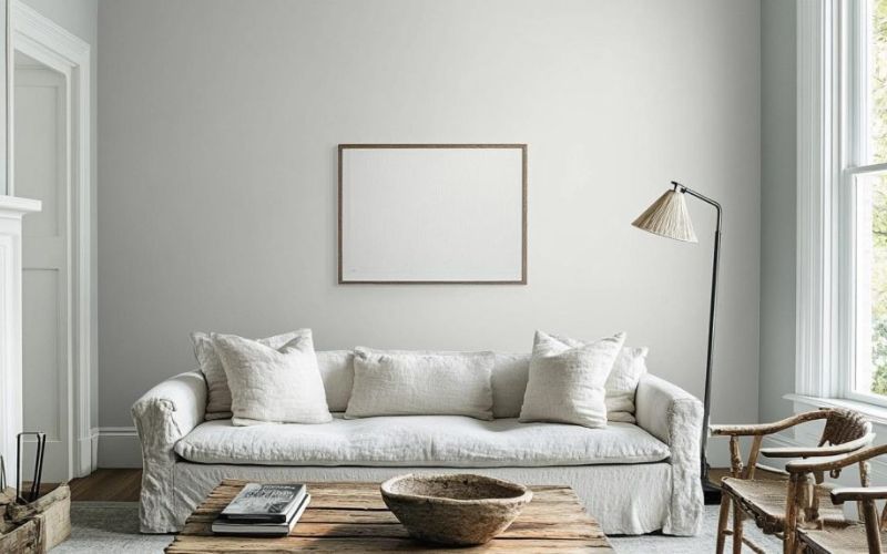
One of the most crucial considerations when selecting SW 7666 Fleur de Sel is lighting. Because natural and artificial light alter how a paint’s undertones are perceived, the same paint may appear different throughout the day.
The colour may appear softer in bright afternoon sunlight, yet it may feel colder in a room facing north. The appearance of the green undertone can also be influenced by artificial lighting.
How Does It Appear in Natural Light?
Fleur de Sel can look clean and bright in natural light. Particularly when blue, green, or grey hues are present, its little green undertone could become a little more noticeable.
The colour may feel especially airy in large windows.
How Does It Appear in a Room Facing North?
Rooms facing north typically get softer, colder daylight. Fleur de Sel may appear cooler and its green undertone may be more pronounced in this setting.
If you already have blue accessories or cool grey furnishings in your room, try the colour first to make sure it feels good overall.
How Does It Appear in a Room Facing South?
Stronger and warmer natural light is frequently received by rooms facing south. Fleur de Sel may appear softer and more balanced as a result.
Its faint green undertone may appear less chilly because to the additional warmth from the sun.
How Does It Appear at Nite?
Artificial lighting can alter any white paint’s appearance at nite. Cooler bulbs could highlight Fleur de Sel’s freshness, while warmer bulbs can make it appear softer.
Because of this, before painting a whole room, inspect your sample both during the day and at nite.
Why Do You Need to Try Fleur de Sel First?
Because digital photos cannot accurately depict a paint colour in your house, paint samples are crucial.
Sherwin-Williams specifically points out that real colours may differ from how they seem on screen and advises looking at a physical sample before deciding.
Where Can SW 7666 Fleur de Sel Be Used – Locate a Placement!
Fleur de Sel’s adaptability is one of its greatest benefits. It can be used in many areas of a house because it is a light neutral with a little undertone.
Sherwin-Williams provides homeowners with a variety of options by listing the colour for both exterior and interior use.
Is Fleur de Sel Suitable for a Living Room?
Indeed. If you’re looking for a light and airy living room, fleur de sel can be a great option.
It is particularly effective with:
- Furniture made of light wood
- Natural textiles
- Accessories for cream
- Soft grey furnishings
- Baskets made of woven
- Greenery
- decorations along the coast
- The outcome might seem tidy without being unduly formal.
Is Fleur de Sel Suitable for a Bedroom?
Soft white works well in bedrooms because it provides a straightforward backdrop for furniture and décor.
Fleur de Sel complements light wood, subdued green accessories, gentle grey accents, and linen bedding. Additionally, the room may feel clean and fresh due to the slight coastal aspect.
Does Fleur de Sel Work Well in a Kitchen?
In kitchens with lots of natural light, fleur de sel can be particularly appealing. Sherwin-Williams particularly lists SW 7666 as one of their kitchen colour inspirations, noting that it complements open areas with lots of natural light and stainless steel appliances.
It is compatible with:
- White cabinets
- Wooden cabinets
- Steel that is stainless
- Countertops that are light
- Stone that is natural
- Basic black hardware
Is Fleur de Sel Safe to Use in a Bathroom?
Indeed. It is appropriate for bathrooms where you want an air of cleanliness and openness because of its fresh appearance.
For a serene appearance, use it with light tile, natural wood, brushed metal, delicate green accents, or straightforward white fixtures.
Is It Possible to Apply Fleur de Sel on External Walls?
Fleur de Sel is listed as an interior/exterior colour by Sherwin-Williams.
However, you should always test the colour of an exterior in the real sunshine of your house. Colours might appear very differently in outdoor illumination than in inside lighting.
Which hues go well with fleur de sel – Coordinate Colours!
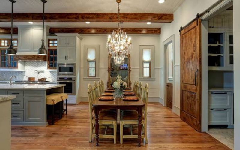
Fleur de Sel can be enhanced with a well-chosen colour scheme. It complements a variety of neutral, natural, and coastal hues since it is a gentle white with a faint green undertone.
Extra White SW 7006 is currently listed by Sherwin-Williams as a matching colour for Fleur de Sel. Additionally, the brand advertises Carley’s Rose SW 9002 and March Wind SW 7668 as complementing colours.
Which White Trim Matches Fleur de Sel?
Sherwin-Williams’ approved coordinating option is Extra White SW 7006.
You may get a modest contrast without introducing a whole new colour family by using a brighter white on the trim.
Does Fleur de Sel Complement Green?
Indeed. Its natural quality can be enhanced by soft greens.
Gray-green, olive, and muted sage accessories can work well together to create a serene look. If you want the room to be simple, don’t use too many competing shades.
Does Blue Go Well With Fleur de Sel?
Fleur de Sel’s beach vibe can be enhanced by blue.
Muted navy, dusty blue, and soft blue-gray can all produce varying degrees of contrast. Deeper blue produces a greater focus point, whereas lighter blue offers a softer appearance.
Are Wood Tones Suitable for Fleur de Sel?
Of course. This light colour can be made cosier with natural wood.
Natural wood finishes like oak and light walnut can keep the overall design casual while preventing the space from seeming overly chilly.
Is Fleur de Sel Compatible With Grey?
Indeed. When used with Fleur de Sel, soft grey can produce an elegant neutral colour scheme.
Taking into account the undertones is crucial. While a softer neutral grey can produce a more balanced appearance, a very blue-gray may highlight Fleur de Sel’s cool side.
What Is the Difference Between Fleur de Sel and Other Whites – Contrast White People!
Because subtle undertone variations can have a significant visual impact, selecting between different white paints can be challenging.
Fleur de Sel is more than just a substitute for all other whites. It has a unique identity due to its faint green impact.
Extra White vs. Fleur de Sel
Fleur de Sel appears softer, whereas Extra White is crisper and brighter.
Extra White could be helpful if you want a clean trim look and a sharp contrast. Fleur de Sel might be a better choice if you want the walls to have a more delicate coastal feel.
Alabaster against Fleur de Sel
Another popular Sherwin-Williams white is Alabaster SW 7008. Alabaster typically conveys a warmer image than Fleur de Sel.
If you want a fresher, cooler look, Fleur de Sel is something to think about.
Sea Salt vs. Fleur de Sel
Although these colours are not the same, they may sound similar due to their shared affinity with the coast.
According to Sherwin-Williams, Fleur de Sel is a white with a faint green undertone, whereas Sea Salt SW 6204 is a calm, muted green with blue overtones.
Fleur de Sel is therefore a considerably lighter and more white-focused option.
Snowbound vs. Fleur de Sel
Another well-liked Sherwin-Williams white is Snowbound SW 7004. Snowbound can provide a varied neutral flavour, whilst Fleur de Sel has a more obvious fresh green effect.
Instead of depending solely on photographs from the internet, always compare samples in your own space.
Origami White vs. Fleur de Sel
Another Sherwin-Williams white that might be taken into consideration for a soft neutral is Origami White SW 7636.
If you prefer a subtle coastal or nature-inspired undertone over a simple neutral appearance, fleur de sel is very intriguing.
Which Decorating Styles Go Well With Fleur de Sel – Fashion Your Area!
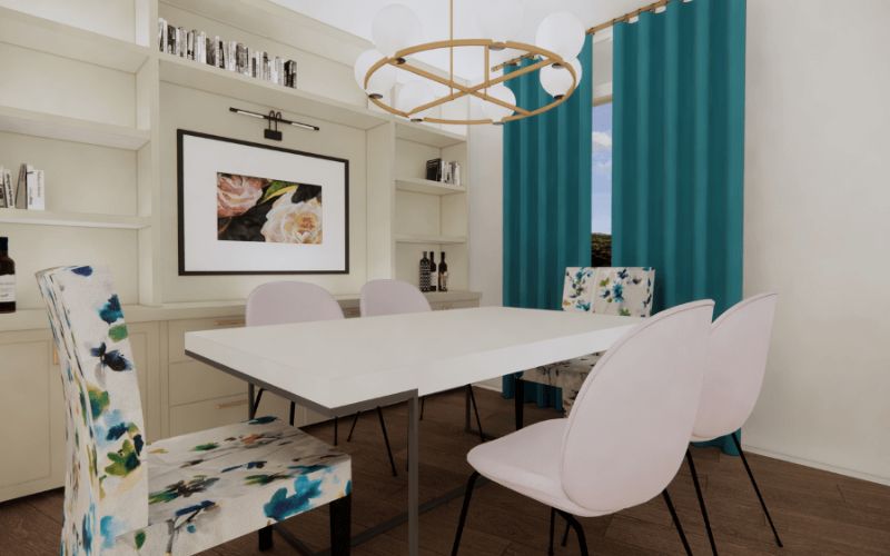
Because fleur de sel creates a subdued background rather than drawing attention, it can be used in a variety of decorative styles.
Its delicate appearance can complement light-filled, natural, and uncomplicated rooms very nicely.
Coastal Design:
One of the most obvious combinations is this one. Incorporate basic seaside-inspired accessories, light wood, linen, woven textures, and gentle blue.
Contemporary Design:
A contemporary space with simple furniture and crisp lines can be softened with fleur de sel.
To create contrast without overpowering the walls, use accents made of black or dark metal.
The Scandinavian Style:
Simple furniture, natural textures, light wood, and uncluttered areas can all work well with Fleur de Sel.
The colour aids in preserving the air of openness and brightness that is frequently connected to Scandinavian-inspired interior design.
Farmhouse Design:
When paired with natural wood, basic textiles, vintage-inspired accessories, and neutral furniture, Fleur de Sel can complement farmhouse décor.
Style: Minimalist:
Quiet wall colours are frequently beneficial for minimalist spaces. Furniture, artwork, and textiles can take center stage while fleur de sel provides a light background.
How Can a Whole-Home Palette Incorporate Fleur de Sel – Arrange Colours!
Particularly with open floor layouts, a single colour can be used to generate visual flow across multiple spaces. While various hues provide character, fleur de sel can be used as a unified backdrop.
For instance, you may add various accent colours to each room and utilise Fleur de Sel on the main walls.
Muted blue might look good in a bedroom. Natural green could be used in a living room. Stainless steel and wood could be used in a kitchen. Coastal or soft grey items could be used in a bathroom.
This method maintains the home’s cohesiveness without giving each space a uniform appearance.
What Are SW 7666 Fleur de Sel’s Benefits and Drawbacks – Consider Your Options!
Fleur de Sel has benefits and potential drawbacks, just like any other paint colour. You can determine whether it matches your space by being aware of both.
Advantages:
- Luminous and airy appearance
- Very little hint of green
- New coastal personality
- works with a variety of muted hues
- Ideal for several rooms
- Listed for both outdoor and indoor use
- Able to work with natural wood
- Ideal for both conventional and contemporary settings
- Drawbacks
- In some lighting conditions, its undertone could become more apparent.
- In rooms facing north, it could appear cooler.
- If you’re looking for a warm, creamy white, this might not be the ideal option.
- The colour may not be accurately depicted in online photographs.
- Its look can be altered by surrounding colours.
Testing the paint before committing to a huge surface is the most crucial stage.
How Do You Pick the Correct Finish – Select Finish!

The end product is more than just the colour of the paint. The appearance of surfaces and walls is also influenced by the finish.
Depending on the space and product range, homeowners frequently choose wall finishes including matte, eggshell, or satin. Higher-sheen coatings can highlight surface flaws and typically reflect more light.
Even when the same or matching white is used for trim and doors, a distinct sheen can produce a subtle contrast.
The surface, space, desired look, and particular Sherwin-Williams paint product you select will all determine the ideal finish. Always adhere to the application guidelines provided by the product.
How Can Fleur de Self Be Used to Create a Coastal Room – Establish Coastal!
To create a beach interior, seashell decorations are not necessary everywhere. While textures and organic materials develop the idea, fleur de sel might serve as the light foundation.
Consider combining:
- Light-colored walls
- Wood that is natural
- Curtains made of linen
- Baskets made of woven
- Blue cushions that are soft
- Greenery
- Basic artwork
- Rugs that are neutral
- Accents made of natural stone
Instead of creating an overtly themed area, the objective is to create a calm atmosphere.
FAQs:
Is Fleur de Sel SW 7666 a genuine white?
Instead of being a very stark white, fleur de sel is a delicate white. According to Sherwin-Williams, it has a fresh seaside aspect and is a dazzling white with a faint green undertone.
Is there a hint of green in Fleur de Sel?
Indeed. It has a very faint green undertone. Lighting, surrounding colours, carpeting, furniture, and the orientation of your windows can all affect how much you notice.
Does Fleur de Sel work well in a tiny space?
Because it is a light colour, it may function effectively in compact spaces. Although lighting and the room’s finishes still have an impact, its comparatively high LRV can assist maintain a bright impression.
Which hue complements Fleur de Sel the best?
Extra White SW 7006 is listed as a coordinating colour by Sherwin-Williams. Its maritime vibe can also be enhanced by soft blues, subdued greens, natural wood, and soft greys.
Before painting, should I try some Fleur de Sel?
Indeed. Because paint might appear differently depending on the lighting and surrounding surfaces, sampling is highly advised. Because on-screen renderings sometimes differ, Sherwin-Williams explicitly recommends seeing an actual sample.
Conclusion:
Soft and adaptable, SW 7666 Fleur de Sel adds a delicate beach vibe to the house. Its subtle green undertone gives it more personality than a plain white while maintaining a clean, bright appearance.
It can be used in bathrooms, kitchens, living rooms, bedrooms, and other areas. Additionally, Sherwin-Williams lists it for both outdoor and indoor usage.
Natural wood, delicate blues, subdued greens, soft greys, and clean white trim can all look great with this colour. Additionally, it is adaptable enough to go with minimalist, modern, Scandinavian, farmhouse, and seaside home designs.











Leave a Reply